4.7 Phenology Image Generator
Seasons Theme
It was necessary to alter the operation of the WeeWX Image Generator to draw the horizontal development-stages lines for crop and pest Growing Degree-Day charts (above), but the Phenology extension does not stop at modification. Instead it indulges in a rewrite of the WeeWX Image Generator. The shading techniques used to produce the horizontal development-stages lines require semi-transparent images, so the Phenology Image Generator comes equipped to handle image composition with backgrounds.
Further, the Phenology Image Generator uses a theme structure to specify image options that control appearance.
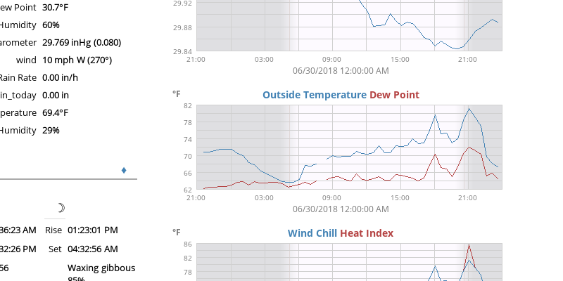
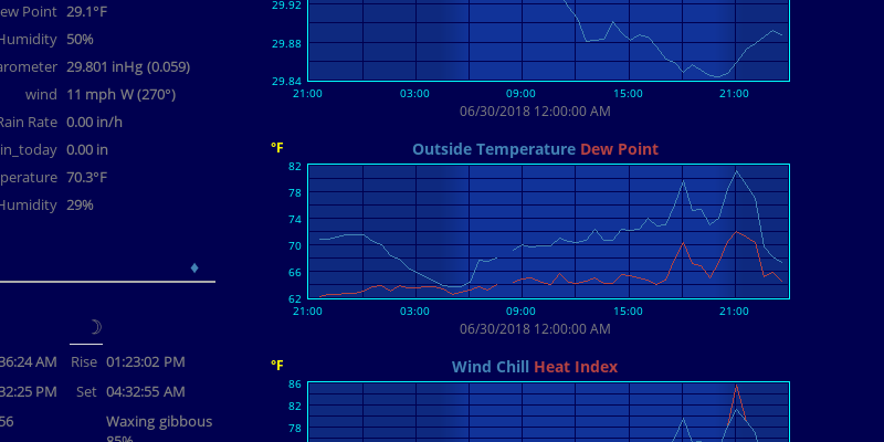
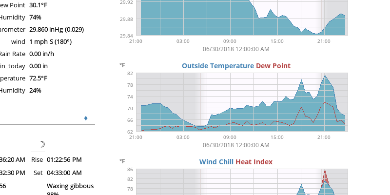
The Phenology Image Generator "Seasons" theme mimics the charts produced by the WeeWX Seasons skin. By default the Phenology extension produces a (mostly) complete, consistent, and coherent set of charts that duplicate the WeeWX charts regardless of the chosen theme.
4.7.1 Themes
A portfolio of pre-defined themes is included in the [[Themes]] stanza of $SKIN_ROOT/Phenology/phenology.conf. The active theme is the one called [[[Current]]]:
[Extras]
  [[Themes]]
    [[[Seasons]]]
      themes =
    [[[Current]]]
      themes = Seasons
Themes may refer to one another in a cascade. Thus the Current theme refers to the Seasons theme. Note that the Seasons theme is an empty theme. All its image options are defaults.
Image options (if any) are specified as scalars in a theme stanza.
The "themes" scalar may be specified in any given theme. It is a comma-separated list of other theme names. The image options used by the other themes are brought into the given theme — theme by theme from right to left — before image options used by the given theme (if any) are applied.
Here are examples of pre-defined themes.
These are all whimsical. If you're aiming for legibility and ease of comprehension (And who doesn't?), you should stick to the Seasons theme; nevertheless, you are invited to expend hours of tinkering, devising your own, as I have.
4.7.1.1 Blackboard
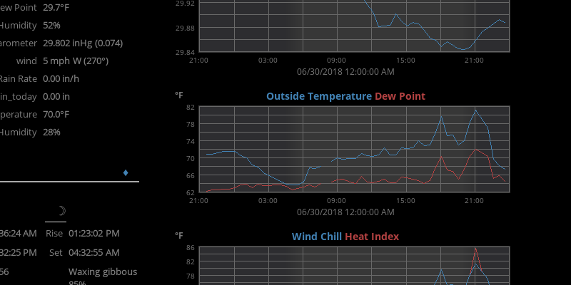
Blackboard Theme
Blackboard is a reverse-video theme.
[Extras]
  [[Themes]]
    [[[Night]]]
      image_background_color = "Black"
      image_border_color = None
    [[[Mist]]]
      chart_background_color = "#ffffff37"
      chart_border_color = None
    [[[Text Gray]]]
      unit_label_font_color = "#787878"
      bottom_label_font_color = "#787878"
      axis_label_font_color = "#787878"
    [[[Shade]]]
      daynight_day_color = "#00000000"
      daynight_night_color = "#00001030"
      daynight_edge_color = None
    [[[Blackboard]]]
      report_body_style = "background-color: Black; color: Gray;"
      chart_gridline_color = "DimGray"
      themes = Night, Mist, Shade, Text Gray
    [[[Current]]]
      themes = Blackboard
4.7.1.2 Yellowboard
Yellowboard Theme
Yellowboard is a reverse-video theme, too, but with brighter axis labels. The differences between themes can be profound or subtle.
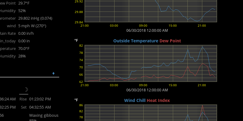
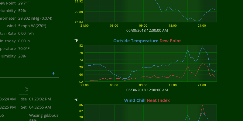
4.7.1.3 Greenboard
Greenboard Theme
Both Greenboard and Yellowboard hark back to the days when educators used yellow chalk because they thought it resulted in less eye fatigue than white.
4.7.1.4 Henry the Navigator

Henry the Navigator Theme
Henry the Navigator gives your Web pages a Renaissance feel.
4.7.1.5 The Woods

The Woods Theme
Bound off into wild backgrounds.
4.7.1.6 Sperry 1100
Sperry 1100 Theme
I was once smitten by the beauty of the front panel on the Sperry-Univac 1100-Series computers where console operators used to dial in their jump keys. It was an under-appreciated piece of industrial art whose color scheme inspired this theme.
4.7.1.7 Friden Flexowriter

Friden Flexowriter Theme
Before interior designers turned to the blues, oranges, and mauves of the Space Age, there came the Jet Age and, before that, the Turboprop Age. The Friden Calculator Company manufactured a line of what can only be described as word-processing machines with paper-tape memory. These Flexowriters were used to streamline form-filling and data-capture. They enlivened the battle-ship gray interiors of military and industrial offices with their earthy hues.
4.7.1.8 Spring

Spring Theme
Experience Springtime in the Rockies. This theme combines noon-day and dusk images from a webcam in Grand Teton National Park in Wyoming.
This theme half-way works for day images, but don't expect too much from it for week images.
Be aware that the Phenology Image Generator uses advanced composition techniques. These techniques are much more expensive in terms of computer cycles consumed than those used by the WeeWX Image Generator. Depending on the size of the background images supplied, you should expect to see the time required to produce all the charts grow by an order of magnitude or more. If you are determined to save machine cycles, you must find other smaller images than those provided by the Phenology extension.
4.7.2 Color Names
Opaque Curve Fill
Colors are specified in Phenology/skin.conf according to their X11 names that are commonly used in HTML. They may also be given as #RRGGBBAA strings, where RR, GG, and BB are the red, green, and blue components in hexadecimal, respectively, and AA is the optional alpha transparency. The 0xBBGGRR notation used in WeeWX skins continues to work, too.
Colors without an alpha channel are opaque. Suppose "fill_curve" is true. Then the default fill colors obscure one another.
[Extras]
  [[Themes]]
    [[[Current]]]
      themes = Seasons
      fill_curve = True
Transparent Curve Fill
But, if "chart_fill_colors" are defined to be transparent, then they will show through one another.
[Extras]
  [[Themes]]
    [[[Current]]]
      themes = Seasons
      fill_curve = True
      chart_fill_colors = "#72b2c48f", "#c472728f", ...
4.7.3 Image Options
Here is a list of image options that the Phenology Image Generator recognizes. The defaults are the ones imposed by the Phenology/skin.conf, not the python script.
| Name | Type | Default | Description |
|---|---|---|---|
| data_type | ID | None | Normally the stanza name specifies the variable to be plotted and is unique within each chart. This is not true when the same variable is plotted twice on the same chart with different "aggregate_type"s. "Data_type" overrides the stanza name, and, then, stanza name can be anything unique for each curve on the same chart. |
| label | Text | None | If given, this is used in place of the data_type in the chart title. |
| image_width | Pixels | 500 | This is the width of a chart. |
| image_height | Pixels | 180 | This is the height of a chart. |
| image_background_color | Color | White | This is the color of of the background around the chart. |
| image_background_pattern | Image | None | This is the background image, which is drawn over the "image_background_color." |
| image_border | Pixels | 2 | This is the thickness of the image border. |
| image_border_color | Color | None | This is the color of the image border. |
| chart_background_color | Color | White | This is the color of of the background inside the chart axes. |
| chart_background_pattern | Image | None | This is the background image, which is drawn over the "chart_background_color." |
| chart_border | Pixels | 2 | This is the thickness of the chart border. |
| chart_border_color | Color | None | This is the color of the chart border. |
| chart_gridline_color | Color | #d0d0d0 | This is the color of the gridlines. |
| anti_alias | Integer | 1 | This magnification factor is applied to the chart dimensions. You can easily double the size of the chart by specifying an "anti_alias" of 2. |
| top_label_font_path | Font | font/OpenSans-Bold.ttf | This is the font used to display the titles of the curves on the chart. |
| top_label_font_size | Points | 14 | This is the size of the text in the top label. |
| unit_label_font_path | Font | font/OpenSans-Bold.ttf | This is the font used to display the y-axis label. |
| unit_label_font_size | Points | 12 | This is the size of the text in the y-axis label. |
| unit_label_font_color | Color | #787878 | This is the color of the y-axis label. |
| axis_label_font_path | Font | font/OpenSans-Regular.ttf | This is the font used to display the tic labels. |
| axis_label_font_size | Points | 10 | This is the size of the text in the tic labels. |
| axis_label_font_color | Color | #787878 | This is the color of the tic labels. |
| bottom_label_font_path | Font | font/OpenSans-Regular.ttf | This is the font used to display the date text at the bottom of each chart. |
| bottom_label_font_size | Points | 12 | This is size of text in the bottom label. |
| bottom_label_font_color | Color | "#787878 | This is color of the text in the bottom label. |
| bottom_label_offset | Pixels | 3 | This is the vertical offset of the bottom label down away from the axis labels. |
| bottom_label_format | strftime | %x %X | This is the date format used to print the generation date at the bottom of each chart. |
| rose_mask | Image | icons/North_Pointer.png | This is the compass rose used on wind vector charts. |
| rose_color | Color | #fc402077 | This is the the semi-transparent color of the compass rose on wind vector charts. |
| vector_rotate | Deg | 90 | This is the angle of North on the wind vector charts. |
| horizon_label_font_path | Font | font/OpenSans-Bold.ttf | This is the font used to label the development horizons. |
| horizon_label_font_size | Points | 12 | This is the size of the text on development horizons. |
| horizon_label_font_color | Color | DarkRed | This is the color of the text on development horizons. |
| horizon_label_padding | Pixels | 1 | This is the vertical offset of the development horizon label from the horizon line. |
| horizon_shading | Pixels | 15 | This is the vertical width of the shading gradient under the development horizon. |
| horizon_shading_color | Color | #ffbbbb77 | This is the color of the shading gradient under the development horizon. |
| horizon_edge_color | Color | Red | This is the color of the development horizon line. |
| color | Color | None | This is the color used to draw a curve line on a chart. |
| chart_line_colors | Color | Tuple | These are the colors used to draw curves. These colors are also used to color-code the name of each curve in the chart title. "Color" applies to all curves. "Chart_line_colors" has multiple values for the separate curves. "Color" takes precedence. |
| fill_color | Color | None | This is the color used to fill bar charts and optionally line charts. |
| chart_fill_colors | Color | Tuple | These are the colors used to fill curves and bar plots. "Fill_color" applies to all curves. "Chart_fill_colors" has multiple values for the separate curves. "Fill_color" takes precedence. |
| chart_fill_pattern | Image | None | This is an image, which is drawn over the "fill_color." |
| marker_size | Pixels | 8 | This is the size of plot markers. |
| marker_type | Ordinal | None | This is the shape of the marker used at each data point along a curve. It may be "cross," "x," "circle," "box," or "None." |
| width | Pixels | 1 | This is the thickness of a curve on the chart. If it is greater than one, the curve line is dilated with a 3x3 kernel. |
| chart_line_width | Pixels | 1, 1, 1 | This is the thickness in pixels of curves on the chart. "Width" applies to all curves. "Chart_line_width" has multiple values for the separate curves. "Width" takes precedence. |
| line_gap_fraction | Ratio | 0.03 | Larger gaps between data points in proportion to the nominal length of the x-axis are not plotted. |
| show_daynight | Boolean | True | This determines whether day/night phases are illustrated in the chart. |
| daynight_day_color | Color | #fdfaff | This is color of the day phase of a chart with "show_daynight" before the "daynight_day_pattern" is applied. |
| daynight_night_color | Color | #dfdfe2 | This is color of the night phase of a chart with "show_daynight" before the "daynight_night_pattern" is applied. |
| daynight_edge_color | Color | #e0d8d8 | This is the color of a vertical line drawn on the day/night boundary. |
| daynight_day_pattern | Image | None | This is the background pattern for the day phase of a chart with "show_daynight." It is drawn over the "daynight_day_color." |
| daynight_night_pattern | Image | None | This is the background pattern for the night phase of a chart with "show_daynight." It is drawn over the "daynight_night_color." |
| plot_type | Ordinal | line | The Image Generator produces three kinds of plots (charts): "line," "bar," and "vector." |
| line_type | Ordinal | solid | Normally the Image Generator tries to plot chart curves as "solid" lines. The wind-direction charts are exceptions. They have line_type of "None." |
| fill_curve | Boolean | False | Normally the Image Generator does not fill the area below a curve, whereas plot_type "bar" charts are always filled. |
| aggregate_type | Ordinal | None | This tells how to aggregate readings for longer time scales. It may be "avg," "sum," or "max." |
| aggregate_interval | Seconds | None | This determines the period over which readings are aggregated for longer time scales. |
| time_length | Seconds | 86400 (24 hrs) |
This is the nominal width of the x-axis of a chart. |
| report_body_style | Style | None | All of the Cheetah templates that the Phenology extension provides attach the value of this option to the HTML <body> so that the style of the Web pages and the colors of the charts that appear on them can be coordinated. |
| x_interval | Seconds | None | This is the time spacing between tics on the x-axis. |
| x_label_format | strftime | None | This is the date format used to label the x-axis tics. |
| x_label_spacing | Integer | 2 | This tells how many unlabeled tics are skipped between labeled ones along the x-axis. If x_label_spacing is 2, every other tic is skipped. |
| yscale | Tuple | None, None, None | This is three numbers: The low limit of the y-axis, the high limit, and the interval between tics. |
| y_nticks | Integer | 10 | This is the user-recommended number of ticks along the y-axis. |
| y_label_side | Ordinal | Left | This determines whether the y_axis is labeled on the left side, right side, or both sides of the chart. |
| y_label | Text | None | This is the units label for the y-axis. |
| y_label_format | printf | None | This is the format of the numbers used to label the y-axis tics. |
| y_label_spacing | Integer | 2 | This tells how many unlabeled tics are skipped between labeled ones along the y-axis. If y_label_spacing is 2, every other tic is skipped. |